The Jackson Agency
A full rebrand for a financial services firm — an elegant, approachable identity that makes financial guidance feel personal, trustworthy, and modern.
- Client
- The Jackson Agency
- Industry
- Financial Services
- Services
- Full Rebrand: Strategy, Logo, Typography, Color, Social Media

The Jackson Agency is a financial services firm helping individuals and families build confidence with their money. Its founders wanted a brand as warm and welcoming as the way they work with clients.
The Challenge
Financial brands often feel cold and corporate. The Jackson Agency needed an identity that signaled credibility and expertise while still feeling personal, feminine, and approachable.
Our Approach
We presented two distinct logo directions — a refined display serif and a flowing script — each with its own font pairing and business card application. The client chose Logo One for its balance of elegance and authority.
The Solution
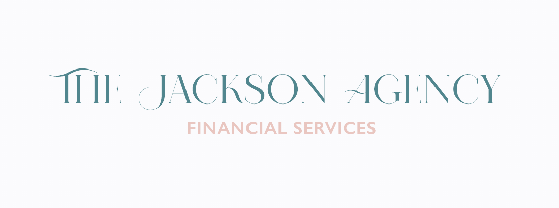
A full rebrand built around a custom-feeling display wordmark with signature swash letterforms, a TJA monogram for social and small spaces, a teal-and-blush palette, and clean sans-serif supporting type.
Refined, Elegant, Unmistakable.
The client chose Logo One. We refined it into a cleaner, more legible wordmark with a full family of marks that work from signage to a profile photo.

A Brand That Feels Personal.
The refined TJA monogram seal distills the wordmark into a compact seal for social media, profile images, and print details — paired with lifestyle photography that keeps real people at the center.
- Main Font
- Cormorant Garamond
- Display serif for the wordmark and headlines
- Sub Font
- Jost
- Clean sans-serif for taglines and body text
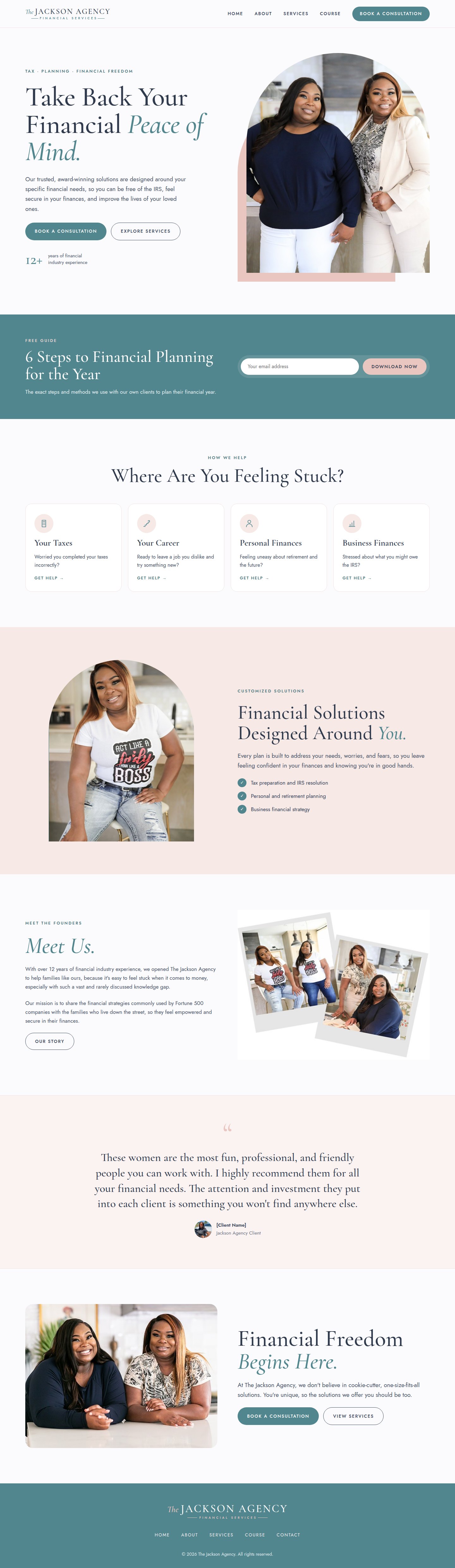
Every section is designed to move a visitor from “I'm stuck” to “Book a consultation.”

A Feed That Builds Trust.
A cohesive Instagram system mixing education, founder photography, social proof, and clear calls to action, all in the refined brand.

“Working with Kelvin Powe Agency gave our brand the polished, welcoming look we had been missing. The new logo, website, and social posts finally reflect how we serve our clients.”
Financial Services

Ready to Elevate Your Brand?
Book a discovery call and let's map out the strategy, design, and systems your business needs to grow.